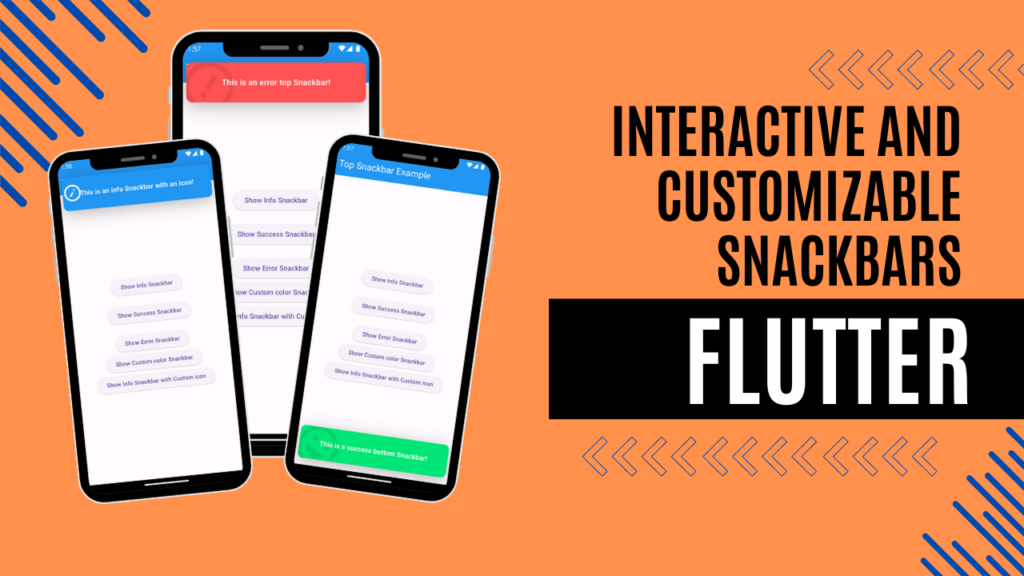
Create Interactive and Customizable Snackbars in Flutter

Snackbars are an essential part of a smooth user experience in mobile app development. They provide a non-intrusive way to display important messages, notifications, or feedback to users. In this blog post, we’ll explore how to create interactive and customizable snackbars in Flutter using the top_snackbar_flutter package. This package provides a way to display attractive snackbars from the top or bottom of the screen with extensive customization options. Unlike the default Snackbar, this package offers more flexibility and options, making it easier to create interactive snackbars that match your app’s design and user experience needs.
The top_snackbar_flutter package is compatible with all the platforms.
Check out the demo video below to see these concepts in action.
First, if you haven’t done so yet, create a new Flutter project.
Configuration
Open your pubspec.yaml file and add the top_snackbar_flutter package as a dependency:
dependencies:
  flutter:
    sdk: flutter
  top_snackbar_flutter: ^3.1.0  # Check for the latest version on pub.dev
Then, run flutter pub get to install the package.
With the configuration complete, let’s move on to the Dart-side modifications.
Importing the Package
Import below packages into the main.dart file where you want to display attractive top Snackbars.
import 'package:top_snackbar_flutter/custom_snack_bar.dart';
import 'package:top_snackbar_flutter/top_snack_bar.dart';
Create Basic Snackbar
In order to show a basic top Snackbar, use the showTopSnackBar function.
showTopSnackBar(
  Overlay.of(context),
  CustomSnackBar.info(
    message: "This is a info top Snackbar!",
  ),
);
Let’s explore some key parameters of this function,
overlayState: It is used to add a specific overlay state, which is necessary for displaying the Snackbar. You can obtain it using Overlay.of(BuildContext).
child: Here, you define the content and appearance of your Snackbar. You can use predefined styles such as CustomSnackBar.info, CustomSnackBar.success, or CustomSnackBar.error.
In addition to these two key parameters, there are several other parameters listed below,
animationDuration: This specifies the duration of the display animation.
reverseAnimationDuration: It is used to specify duration of exit transition.
onTap: It is a callback function that triggers when the user taps on the snackbar.
Customizing Snackbars
Let’s look into how to change the position of the snackbar.
showTopSnackBar(
   Overlay.of(context),
   CustomSnackBar.success(
     message: "This is a success bottom Snackbar!",
   ),
   snackBarPosition: SnackBarPosition.bottom
);
The snackBarPosition property determines the snackbar’s position, either at the top or bottom. You can choose between SnackBarPosition.top and SnackBarPosition.bottom, with the default being SnackBarPosition.top.
The top_snackbar_flutter package provides several pre-built Snackbar styles, such as CustomSnackBar.info, CustomSnackBar.success, and CustomSnackBar.error. Each of these can be further customized.
The CustomSnackBar widget requires the message property, but it also offers several optional properties such as backgroundColor, textStyle, icon, maxLines etc.
Let’s delve into how to customize Snackbars using these properties.
1. Changing Colors
You can customize the background and text colors.
showTopSnackBar(
  Overlay.of(context),
  CustomSnackBar.success(
    message: "This is a success Snackbar with custom colors!",
    backgroundColor: Colors.green,
    textStyle: TextStyle(color: Colors.white),
  ),
);
In the above example, we used the backgroundColor and textStyle properties of the CustomSnackBar widget to modify the Snackbar’s background color and the text style of the message.
2. Adding Icons
You can add icons to make your Snackbars more informative.
showTopSnackBar(
  Overlay.of(context),
  CustomSnackBar.info(
    message: "This is an info Snackbar with an icon!",
    icon: Icon(
      Icons.info_outline,
      color: Colors.blue,
      size: 48,
    ),
  ),
);
Here we used the icon property to customize the Snackbar icon with our own choice.
You can access the full source code of this tutorial by clicking here.
Conclusion
By using the top_snackbar_flutter package, you can create interactive and customizable Snackbars that enhance your Flutter app’s user interface and provide a better user experience. In this blog post, we’ve covered predefined styles available in the package and explored various customization options for Snackbars. Implementing these features can greatly enhance your Flutter app’s user experience.

Leave a Reply