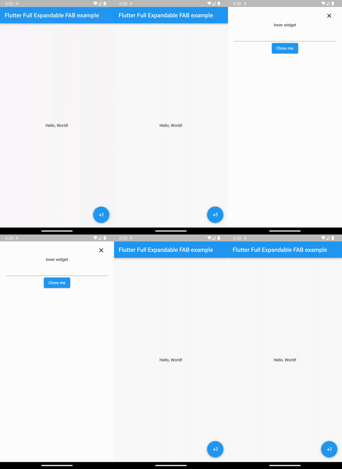
Show animated floating action button with expanded model
Creating an animated Floating Action Button (FAB) which turns into the expanded modal is a great way to enhance the user experience in your Flutter app. In this article, we’ll walk through the steps to create a visually appealing animated FAB which turns into the expanded modal in Flutter.

In order to show animated floating action button, we are going to use full_expandable_fab package. Lets add its dependency inside pubspec.yaml file under dependency section.
dependencies:
  flutter:
    sdk: flutter
  full_expandable_fab: <<latest_version>>
Now lets look at dart side changes.
Add below import statement inside the dart file.
import 'package:full_expandable_fab/full_expandable_fab.dart';
From the build method of our widget, we need to return FullExpandableFab widget. It is stateful widget from full_expandable_fab library. This widget has some mandatory & optional properties. We will see all these properties with their usage in detail.
Refer below code snippet,
...
...

final GlobalKey<ExpandableFabState> keyFab = GlobalKey<ExpandableFabState>();

@override
Widget build(BuildContext context) {
    return FullExpandableFab(
      child: Scaffold(
        appBar: AppBar(
          title: const Text("Flutter Full Expandable FAB example"),
        ),
        body: const Center(
          child: Text(
            'Hello, World!',
          ),
        ),
      ),
      innerChild: Column(
        children: [
          const Text('Inner widget'),
          const TextField(),
          ElevatedButton(
              onPressed: () {
                keyFab.currentState?.close();
              },
              child: const Text('Close me')
          )
        ],
      ),
      icon: const Icon(Icons.plus_one, color: Colors.white,),
      backgroundColor: Colors.white,
      closeIconColor: Colors.black,
      duration: const Duration(milliseconds: 500),
      key: keyFab,
    );
}
....
In above code, we are returning FullExpandableFab widget from the build method.
Now lets understand all the properties of FullExpandableFab widget.
| Property Name | Mandatory/Optional | Widget Type | Description/Usage |
| child | Mandatory | Widget (any) | Main widget that will be shown along with the floating action button. It is recommended to use a Scafold widget as a child. |
| innerChild | Mandatory | Widget (any) | Widget to show into the expanded modal. |
| icon | Mandatory | Icon | Icon to use for floating action button. |
| backgroundColor | Optional | Color | Color to use as background of the expanded modal. By default it is black. |
| closeIconColor | Optional | Color | Color for the close icon. By default, it’s white. |
| buttonBackgroundColor | Optional | Color | Color to use as background for floating action button. By default it’s the primary color of the theme. |
| duration | Optional | Duration | Duration for the animation. By default is 250 millisecond. |
| key | Optional | Key | key is used to get current state of the widget. It is used to close the expanded model. |
Now lets see how to close the expanded model.
keyFab.currentState?.close();
Call close() method on currentState object. Once this method is called, expanded model will be closed. Here keyFab variable is of type GlobalKey, this variable is passed to FullExpandableFab widget to attach the state of the widget(Refer above code).
If you want to check if FAB is expanded, use expanded property on currentState object as shown below.
keyFab.currentState?.expanded
Please click here for complete source code.

Leave a Reply